EliteEnigma57 wrote:
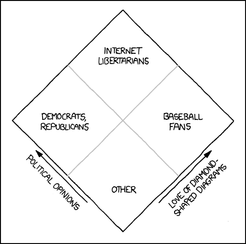
I've seen that "fake Nolan Chart" before, it's pretty funny.
Even if the Nolan Chart doesn't accurately represent international politics, I still don't like how there isn't a buffer space so that people who may only be slightly in a certain zone aren't shoehorned into the same category as, say, extreme anarchists or communists.
On this we agree.
A proper survey should adhere to the "Likert" standard, that being an uneven number of responses going from most positive to the most negative response with a neutral category (usually 5 in total)
plus the "I don't know category".
Surveys with no middle category are often created to artificially boost statistical explanatory power, as they force respondents to takes sides on a political issue regardless of their actual opinion.
Surveys with no "I don't know category" will result in people choosing the middle category frequently when they do not know what to answer...
IMO, the problem with the Nolan chart isn't its composition... It's that the label of liberal/conservative is so frequently applied to one of its dimensions...