Tollorin wrote:
The paper referenced in The Guardian is several years out of date. The data have since been corrected.
Your second reference is a partisan blog that uses circular reasoning (eg, quoting themselves) in an attempt to discredit any scientist that questions the CAGW narrative.
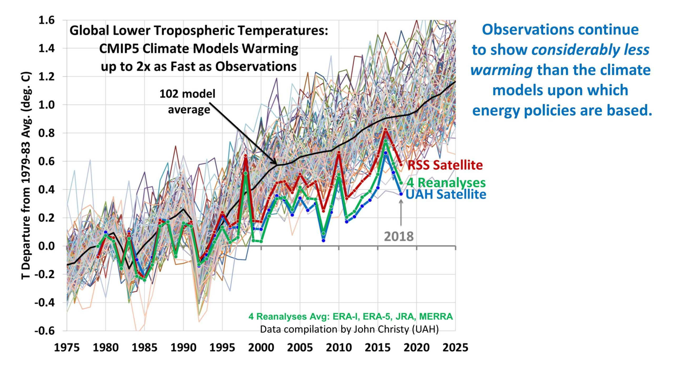
Your third reference is also another partisan blog- and a rather rambling one at that- but doesn't really have anything meaningful to say about the chart and utterly misses the point.
Tollorin wrote:
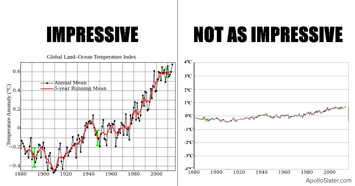
This is not pertinent: more so the left graphic is easier to read, which is why it's presented that way.
It's actually quite pertinent as the purpose of propaganda is to stir up emotions and suppress critical thought. Displaying a minor temperature increase as a big, scary hockey stick is deliberately calculated to do just that.
_________________
Without deviation from the norm progress is not possible.
-Frank Zappa