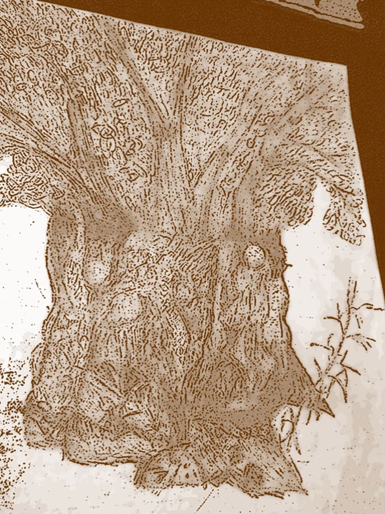
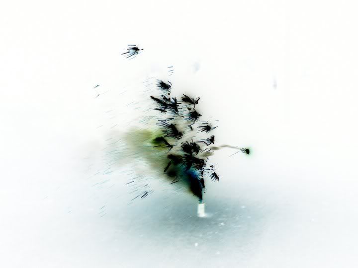
That's a lot of work to critique at once.
For me, the frog is the most impressive rendering.
I applaud you for attempting to convey so much subject matter so close together in this one. (too many artists are so afraid of "clutter" so they won't experiment like that)
chrissyrun wrote:
I think the fatal flaw is the lack of dept, because the 3 sails are too similar in size and the texture of the waves stays on the same scale in the foreground and background.
It also looked like you had to struggle with the size limitations of the markers (or brushes?) with the tiny details, like the bird farthest from the viewer.
The shadows on the house have good shape, but needs to go much darker.
You should have left out the white streaks under the dolphin's flippers, and had them only streaking back from its tail, to imply speed and motion.
I think you should try more pieces with intense compositions like, but I recommend lots more practice sketching & painting of the individual subjects before hand. With so many elements, you might want to try picking an imaginary light source to get consistent shadows (even if it's meant to be surreal).
Maybe I'll critique another piece later.
The easiest thing you can do to improve the presentation quality of all of your work is to change the way you photograph it. These pics look like they were taken inside under artificial light with the camera on automatic settings, sometimes pointed at an odd angle. Photograph your work outside under direct sunlight. Your shutter speed will shrink so you won't get camera-shake, and you can use lower ISO so you don't get a grainy texture. Remember to crop out all distracting details (like the cardboard box and pringles can next to the frog for example).
_________________
Curiosity is the greatest virtue.