Logo Contest - win a prize!


Hi guys, I have a dilemma. I need a logo for my website, but I can't draw worth a crap and I don't know how to do it on a computer. So I hope you guys can help me out here. In exchange, the person whose logo I select will receive the choice of one of 3 handcrafted pens. These are really top-of-the-line pens that you can treasure for many many years. I spend hours hand pouring resins, shaping them with carbide hand tools, I go through a 20 step polishing process all the way up to 48,000 grit. I use buttery smooth twist mechanisms for my twist pens and high precision ceramic rollerball refills made in Germany. All of these pens will come with a leatherette protective carrying pouch with a folder over flap and 3 extra ceramic rollerball refills. I want to reiterate that the winner gets to choose one pen, he or she does not get all of them. People can enter up to 3 logos. You don't have to do 3 but I realize some people might have a few ideas they like. special thanks to cornflake for his advice and stickying this hopefully. This contest will last for 2 weeks.
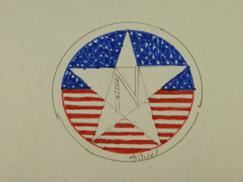
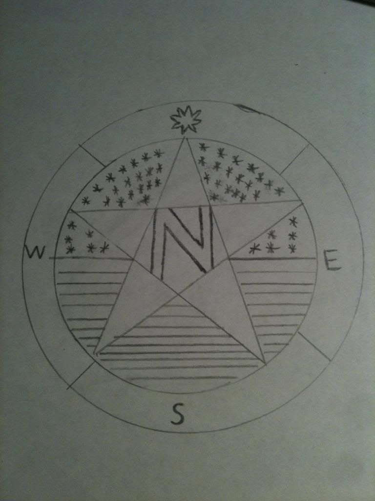
I have the design that I want in mind and I just need someone to execute it. Now mind you, it doesn't have to be exactly my design, but I would like the basic elements of my design in there. Things like the stars and stripes, the N must be in there, I would like the stars to be pentagrams like on a US flag, I would like to have one of the stars in the field different than the others. Maybe 8 sided or something, to represent the Northstar. I marked some parts silver because I just personally like the look of silver with American flag, but whether you guys make a metallic or something else, I kind of envisioned it to what silver that looks metallic and kind of domed if you know what I mean, like the outer ring of a coin, but rounded, not flat. Anyway, I know there's really good artists out there, so I'd love to see your vision, but remember to that if you use my exact design, but you make it symmetrical and make it look beautiful. I'm perfectly happy with that too. If you have any questions don't hesitate to ask.
Here is my design that I was telling you I would like to get close to. Yes I know it's sloppy and looks like crap, but I'm sure you guys can see beyond that and turn it into something beautiful. If years have any questions, by all means post them, and I will answer the best I can.
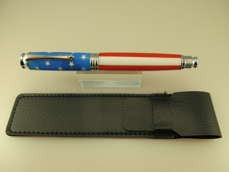
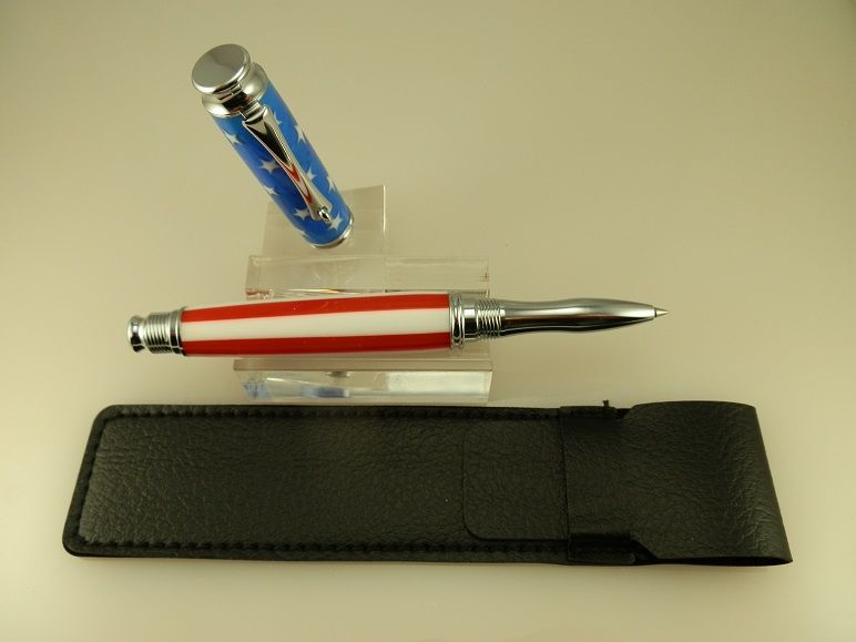
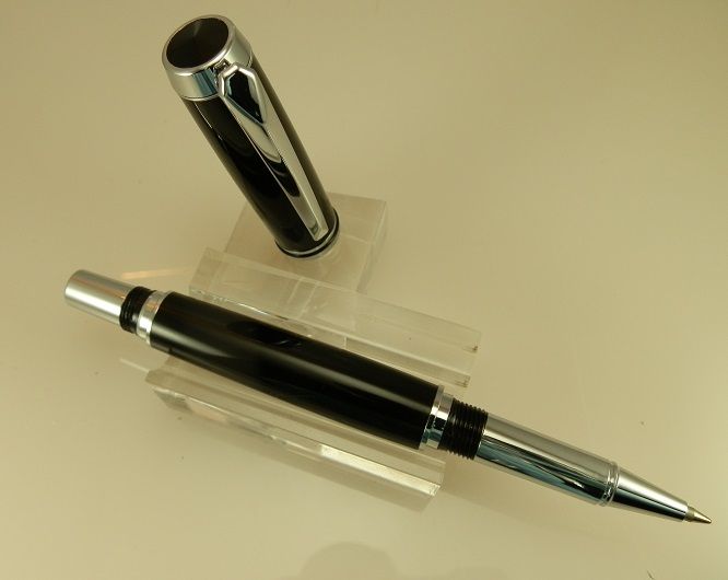
Here are some pictures of the pens that I made for this contest. The 1st one is an American flag pen. I personally think it came out great. Not all of my pens work out some just don't look right in the end. Or there's an unforeseen problem with the material. Sometimes the material even shatters when I'm cutting it. Most of them do turn out fortunately, and I have to say this flag pen, that I call Ol' Glory, came out fantastic. I mean, it just looks good. None of my stuff is injection molded or crap like that, the flag pieces are acrylic resin that I can't turn with carbide hand tools. The material was hand molded then hand cut. I polished this pen to 48,000 grit and it is truly a mirror finish. The trivalent chrome on the metal fittings is also polished to a mirror shine. This pen is a head turner I have to admit to you, I did take it to the store with me because I had it clipped to the front of my shirt and I forgot to take it off. I didn't realize that I even had it on me until the complete stranger at the store complimented me on this pen. By the time I got out of the store, this pen got 3 compliments from complete strangers. The pen has a really nice way to it, not to light and not too heavy, and it is balanced very well. Also, the threading on this pen is super smooth it's only a three-quarter twist to screw the cap on or off either the nib section or the rear section when writing. I like a little bit of curve on my pens and you can see it reflected in his pen. The flag sections are ever so slightly curved in the nib section has a very comfortable ergonomic curve in it. This pen is really comfortable in the hand. I used a Schmid Technologies, ceramic ball refill and this pen just glides across paper.
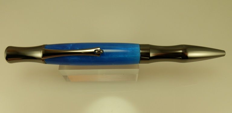
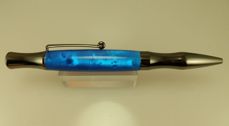
This next pen is it twist pen made with acrylic resin. The color is called Dyna. It is a really beautiful with Micah Pearl powder in it and that reminded me of clouds. I name very much all of my pens and it seemed appropriate to name is on stratosphere. Unfortunately, the pearlescent effect doesn't come out all that well on camera, so you'll have to take my word for it that this pen has amazing depth to it. I used gunmetal and this pen to really bring out the blue, but at the same time, the blue ended up making the gunmetal fittings even more attractive, they go hand-in-hand very well. The twist mechanism is buttery smooth and it locks in the place solidly so you will never have a problem with the nib retracting even when you put heavy pressure on it. The pen is weighted and balanced beautifully and it'll be a joy in the hand. As I'm sure you can tell by the shape of the pen is a very comfortable to write with, its curved in the right places, so to speak.
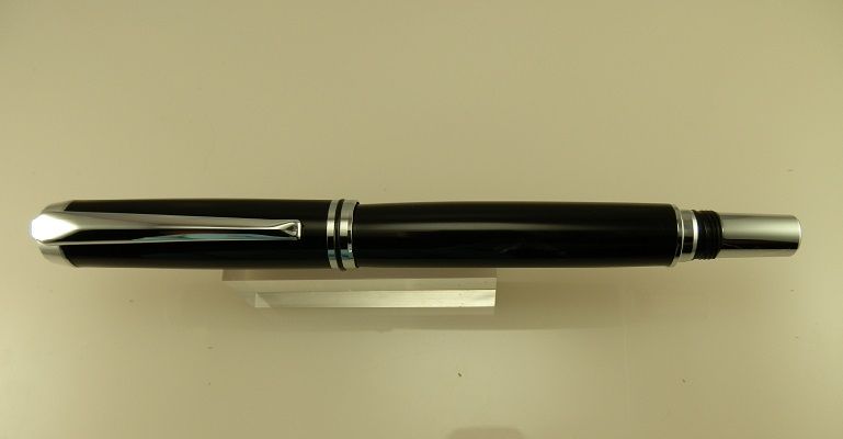
Choice number 3 was the result of one of cornflakes suggestions. I went for a more classic or traditional look with this pen. A lot of the pens that I have made are really bright colors or have interesting patterns, some of them I've made with exotic woods such as amboyna burl. With this pen I just went straight jet black and bright chrome. I called this pen "Liquid Darkness". It is polished literally to a mirror finish. I had to take a bunch of photographs of this pen because my reflection kept showing up on the pen. This pen is so shiny that It looks wet. I have to admit that this is the 1st time I ever made a black pen. I always thought of myself as being out of the box with a lot of the colors on my pens, but the way this turned out... Wow. It just looks classy and elegant. I used alternating chrome and black to give it an extra pop and I think it worked. The alternating black and chrome just looks fantastic. Like the other pens It's a weighted very nicely and is very comfortable in hand. I will definitely be making more black pens in the future because I am really happy with how this one turned out. Well that's it guys, those are the 3 pens, you get to choose from.
Last edited by Rascal77s on 03 May 2014, 3:57 am, edited 1 time in total.
Those are amazing! I have a hand-turned mahogany set I got as a kid, but mostly I just keep a few good engineer's pencils around. These are really something else entirely, I have a distant relative in my state who hand turns much the way you do, last time I visited with my dad & grandfather he tried to give me one; I just couldn't accept it, the attention to detail was too great. In retrospect maybe I really should've.
Anyway I can't say I really know how to spontaneously generate logotypes, design principle is very conflicted about how to do so properly, but I would be happy to render some of your drawings as vector graphics or with transparent backgrounds for your page. I know pixel-perfect icon design pretty well...
edit: I could get started vectoring your graphic & getting the fill patterns right for you on Monday when I get home where most of my machines and supplies are, Wacom included.
_________________
"Standing on a well-chilled cinder, we see the fading of the suns, and try to recall the vanished brilliance of the origin of the worlds."
-Georges Lemaitre
"I fly through hyperspace, in my green computer interface"
-Gem Tos
Sidenote: the 'domed' effect you'd like to see around your sketched logo is termed skeuomorphism, as you described it. I also would like to point out that silver can be a very difficult color to duplicate in digital design as it is usually, as I'm sure you know, associated with shine. Relief patterns in silver take quite some time to duplicate in pixels. I like your idea for the north star being distinguished from the patriotic ones, though it seems to me another relief pattern based out of the checkers you approximated this pattern with would also work nicely.
_________________
"Standing on a well-chilled cinder, we see the fading of the suns, and try to recall the vanished brilliance of the origin of the worlds."
-Georges Lemaitre
"I fly through hyperspace, in my green computer interface"
-Gem Tos
Anyway I can't say I really know how to spontaneously generate logotypes, design principle is very conflicted about how to do so properly, but I would be happy to render some of your drawings as vector graphics or with transparent backgrounds for your page. I know pixel-perfect icon design pretty well...
edit: I could get started vectoring your graphic & getting the fill patterns right for you on Monday when I get home where most of my machines and supplies are, Wacom included.
cburg thank you for the very nice complement. I appreciate the support, but I have to be completely honest with you- I didn't understand a thing you said
cburg I would rate my computer knowledge to be novice level at best, and even that is stretching the truth a bit
your pens are amazing my fav is no 2 the blue is awesome
i have no computer or basic art skills,but i wanted to help.i modified your design a little.i felt like the edge needed something so i added the north star in it and the east,west ,south.i incorporated the right amount of stars and stripes and i felt like the N should be bolder maybe even with a black outline to make it stand out better.
the proportions do need to be adjusted.what do you think?
Im a little disappointed no one else is getting in on this.i tried to get my sister to help but she was busy.i tried to figure out the computer program to make it but i was lost and it was the stock paint program it would not have been very proffetional.
Edit/adition:it could help if people knew what your website was about,it can give more ideas.
MakaylaTheAspie
Veteran
![]()

Joined: 21 Jun 2011
Age: 27
Gender: Non-binary
Posts: 14,565
Location: O'er the land of the so-called free and the home of the self-proclaimed brave. (Oregon)

I don't know if I can find the eye focus to help out here in such a short amount of time(I just noticed the thread), but I was wondering what your plans are for the logo. I know you've mentioned using the logo for your website, so if that's all you were planning to do with it, then the complexity of color and design is not a problem for anybody running out a logo through photoshop, and making it look complex and shiny.
If you are planning to print your logo on a business card, they will ask you to provide a vector file, in which, a .jpg produced by a sexy photo shop design will not suffice. Vector essentially, saves just the space being used by the art work, so it's empty spaces can be shone through by any product surface it's stamped on. So if placed on a cup, any space that's not artwork, would be the color and material of the cup. If you gave them a .jpg, the white around the logo would be printed as a color on whatever it's placed upon. A good program to create and save a vector file in is Adobe Illustrator, if printing the design on such products for promotion and networking is in your plans.
Also, mind that when printing, you pay for every color used. If you can get your logo beautifully complex in a single color, it will only cost you the ink of one color. If your logo has ten colors involved(mind that a shade change is a whole new color, so shadowing instead of using tricks/illusions with hatching, and beveled silver over the illusion of drawn chrome could get very costly), the logo will cost ten times as much to reproduce in comparison to a logo tactfully designed for the use of one ink color.
I used to do graphic design for a paper company for a short stent of time, and most of even the big companies wanted one color samples, and for the logo to still be flashy and all "look at me!"-like.
Also, the complexity of the logo you've designed doesn't seem like it could be branded on your pens because it would have to be far smaller, and in shrinking, would lose most of it's details. Which again, I was just wondering what else you were planning on doing with the logo aside from stamping it on your web page. You can always decide to have a more simple branding type logo made at a later date if that was in your future plans, but maybe also think of less detail oriented designs if you'd like to just hold the familiarity of a single logo for everything.
I just thought if I asked for clarification, it could help your end results with your contest. I certainly wish you the best of luck in finding a good one ![]()
If you have any questions on what the heck I just said about any of it, feel free to PM me and I'll try and clarify. I know you said you're not so into computers, so I'd certainly understand if I didn't make sense. I don't always come here, but my PMs are set to email me notifications, and my email inbox is my home page.
You gave me a lot to think about. You explained in a way that was easy to understand. My most pressing need is a logo for my website. It doesn't have to be permanent, I can always change it later. On hindsight, after reading your post, I realize that I should've gone about this contest differently. I should have just given the name and asked people design logos from scratch, rather than giving somewhat narrow parameters. I'm not sure that WP is the right place to have this contest to begin with but I thought I would try.

Well guys that wraps up my logo contest. I hereby declare lace-Bane the winner logo with an awesome. I am very pleased to award lace-Bane one of my handcrafted pens for the simple yet elegant logo. Congratulations. a PM will be going out to you shortly.
I want to say thank you to everyone else that offer ideas or sketches. All help is appreciated.


